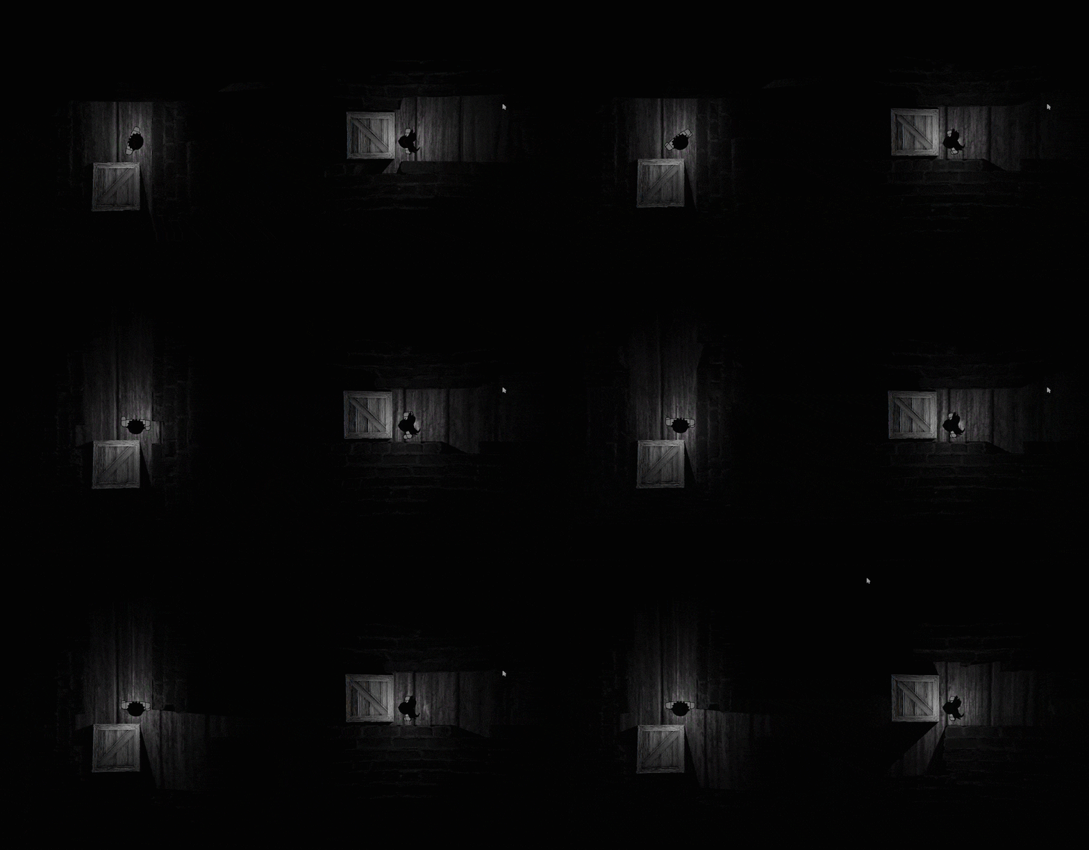
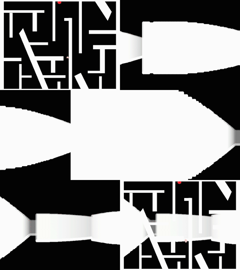
2D lighting system
Making a 2D lighting system for the game Two Opposites.
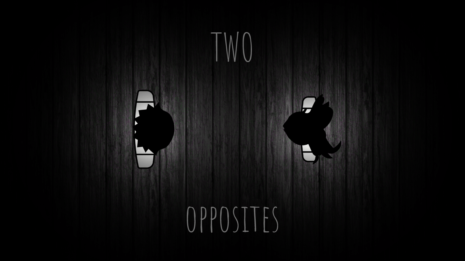
Two opposites is a game about the journey of two opposites (characters with mirrored controls) separated by a mirror. They need to solve puzzles to escape the mirror world and finally meet each other. However, the challenge lies in the fact that they can only solve these puzzles together. You can play it in your browser here.
The game was made in a week (in a team of three) for the Brackeys Game Jam (10k+ people participated worldwide) and ranked #22 in the innovation category.
1.0 2D Lighting System
Upon initial analysis, we decided that the atmosphere should be given the most priority while developing this game. And the visual appeal of the game played a significant role in that. Back when we started working on this project, Unity didn’t have any rendering pipeline that supported 2D lighting. So my task was to develop a 2D lighting system for the game.
1.1 2D Raycaster (GL) - 1st iteration
- The basic idea was to draw transparent lines originating radially outwards from a sprite with negligible separation to give a sense of light coming out.
- I used the Unity’s low level Graphics Library (gl) to draw lines between two points.
The raycast loop formulated-
for (float i = 0; i < theta; i += steps) { GL.Begin(GL.LINES); GL.Color(col); // Initializing GL Library with white color as input GL.Vertex3(player.transform.position.x, player.transform.position.y, 0); //strating point GL.Vertex3(player.transform.position.x + Mathf.Cos(i * Mathf.Deg2Rad) * maxVisiblityDistance, player.transform.position.y + Mathf.Sin(i * Mathf.Deg2Rad) * maxVisiblityDistance, 0); //ending point GL.End(); //clearing garbage }- This loop draws rays from the player’s position to equally spaced points around the player.
- The angle that light covers is governed by
theta. - The spacing between each ray is governed by
steps. - The color of the rays is governed by
col. - The length of light ray is governed by
maxVisiblityDistance. - All of these variables were serialized in the inspector.
- This script is attached to the MainCamera and the loop is called in
OnPostRender()method so that the lines are rendered as soon as the camera finishes rendering the scene.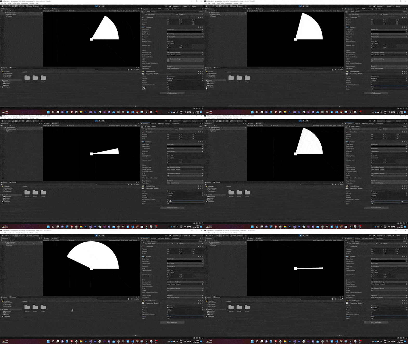

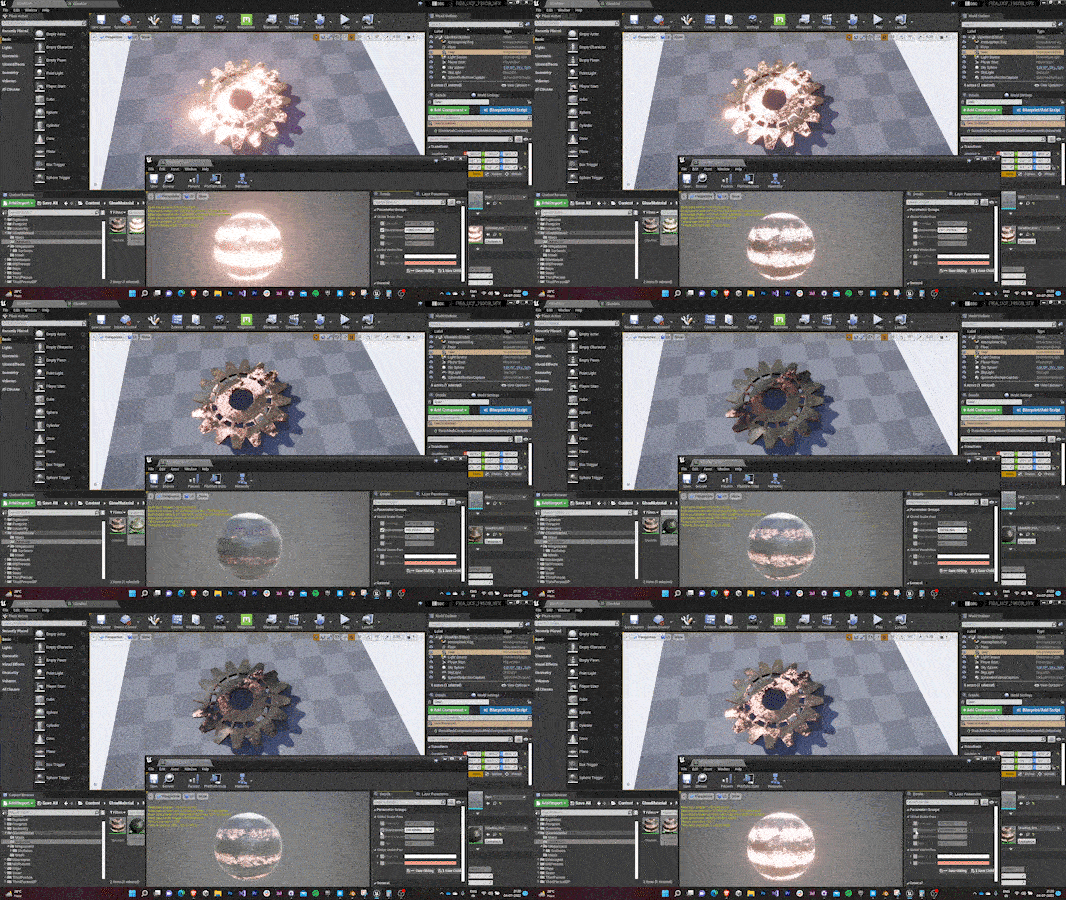
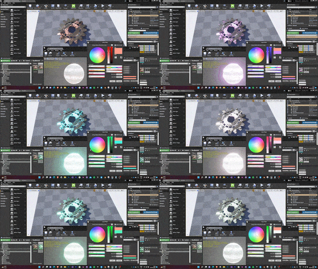
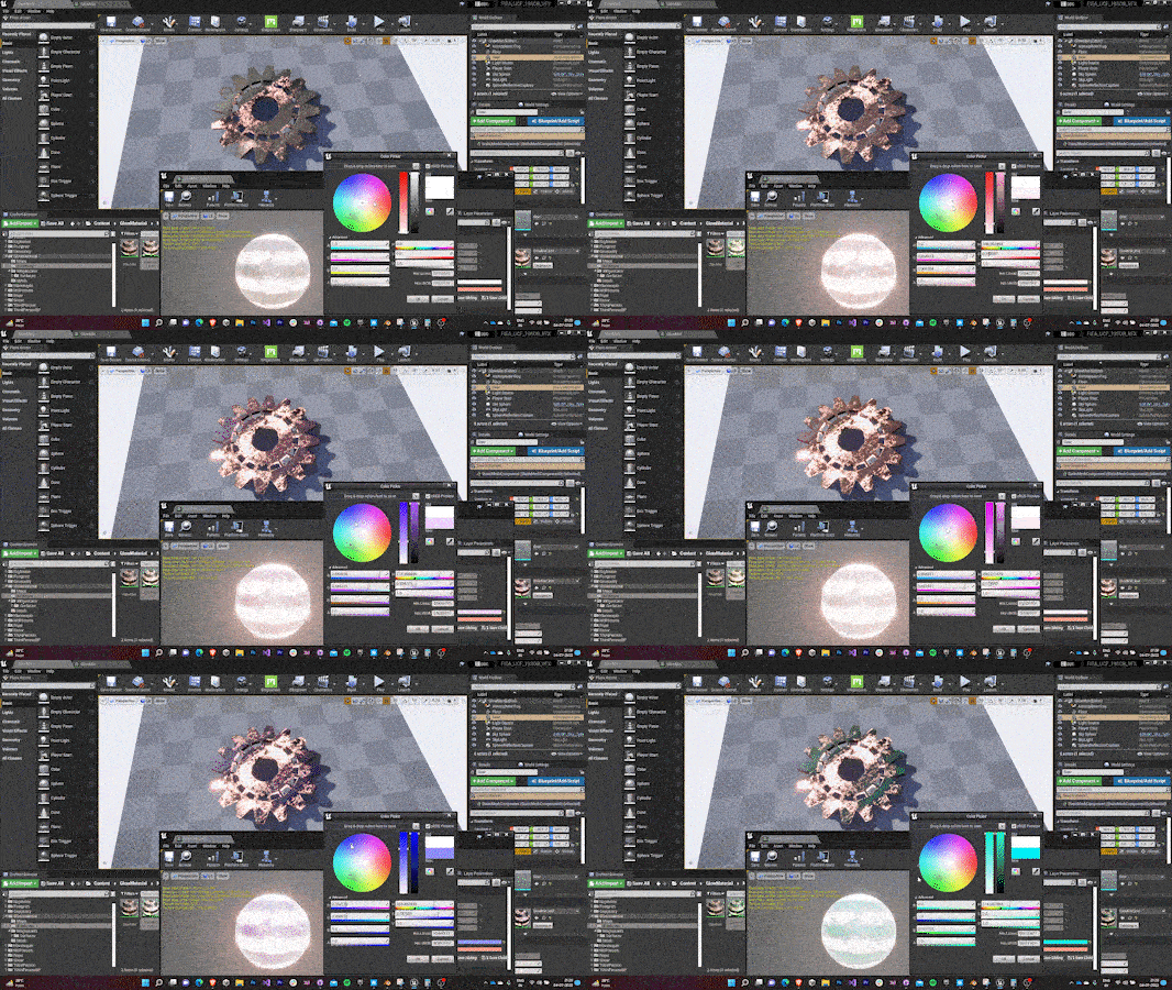
Adjusting theta Adjusting steps 
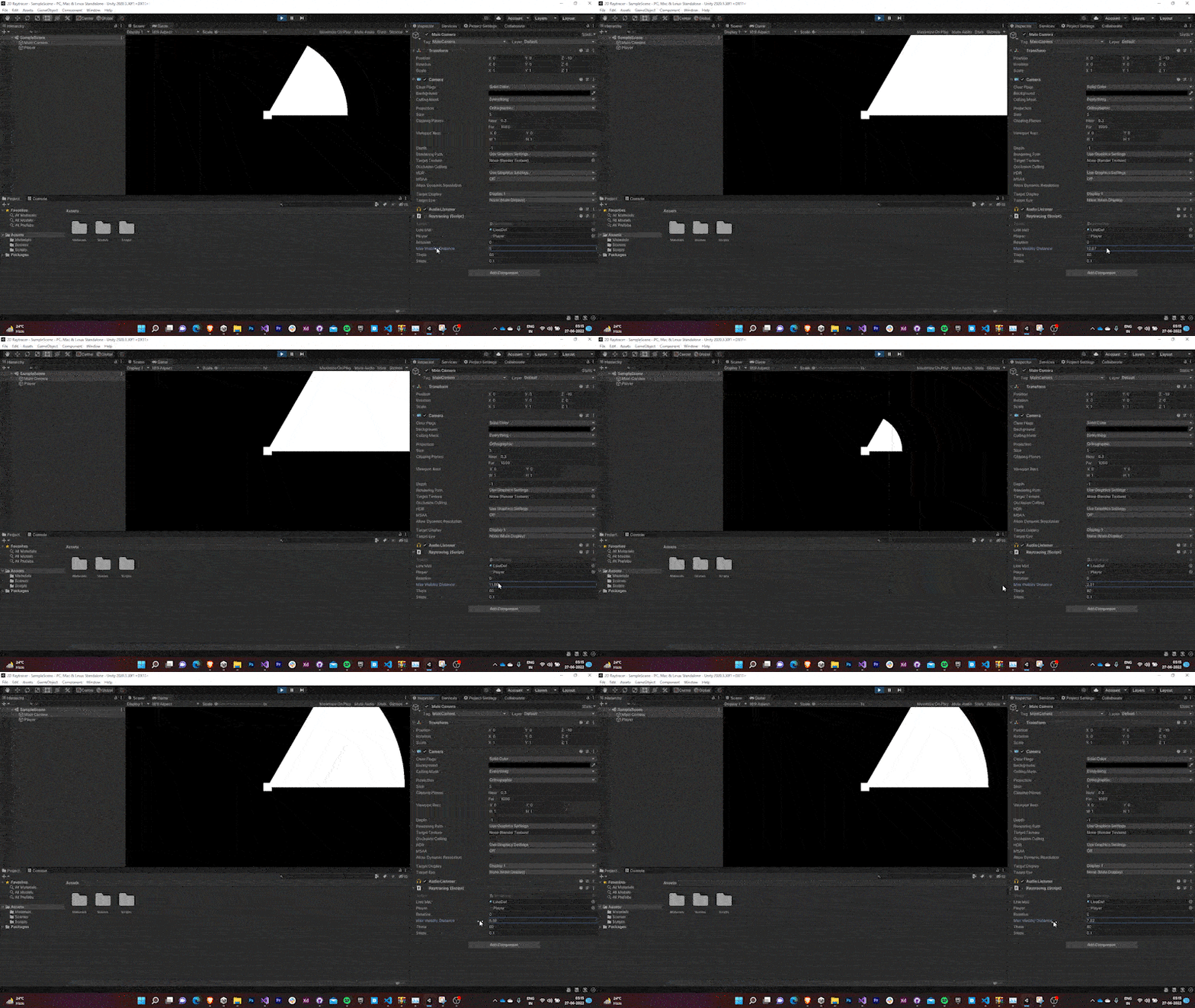
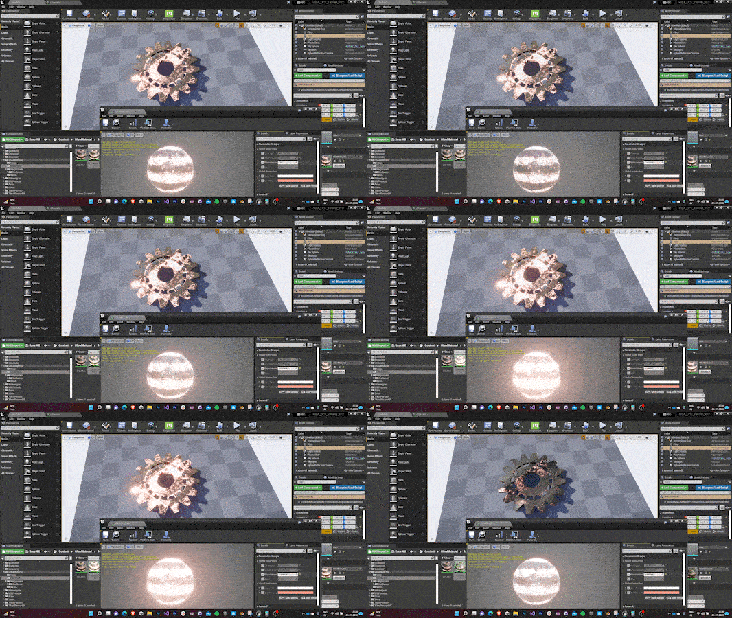
Adjusting color Adjusting max visibility distance
1.2 Ray Material
- The next task to make the light rays feel more natural by introducing transparency.
- While pondering I found that GL library by default uses the Unlit material provided by Unity to create the lines.
- As the Unlit Material doesn’t support transparency by default, I wrote an Unlit Shader that supported both transparency and vertex colors.
- The RGBA values of the colors of the material based upon this shader was passed as an input.
GL.Begin(GL.LINES);
lineMat.SetPass(0);
GL.Color(new Color(lineMat.color.r,
lineMat.color.g,
lineMat.color.b,
lineMat.color.a));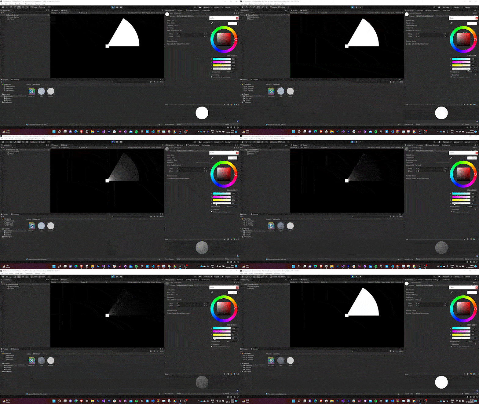
With transparency controls, the rays looked more natural.
1.3 Environment Lighting
- The next step would be to make the scene react to the light rays emitted by the player.
This involved two steps:
Making the light ray stop when it hits an object. This is done by Raycasting along the light rays that GL draws and checking if we’ve hit something.
RaycastHit2D hit = Physics2D.Raycast(player.transform.position,
new Vector2(Mathf.Cos(i * Mathf.Deg2Rad),
Mathf.Sin(i * Mathf.Deg2Rad)),
maxVisiblityDistance);

if (hit)
{
 GL.Vertex3(player.transform.position.x, player.transform.position.y, 0);
 GL.Vertex3(hit.point.x, hit.point.y, 0);
}

else
{
 GL.Vertex3(player.transform.position.x, player.transform.position.y, 0);
 GL.Vertex3(player.transform.position.x +
 Mathf.Cos(i * Mathf.Deg2Rad)* maxVisiblityDistance,
 player.transform.position.y +
 Mathf.Sin(i * Mathf.Deg2Rad)* maxVisiblityDistance,
 0);
}
Making the sprite color of the object depend upon its distance from the light source.
SpriteRenderer sp = hit.transform.GetComponent<SpriteRenderer>();
if (sp != null)
{
 sp.color = new Color(1 / Mathf.Pow(Vector3.Distance(
     hit.transform.position, player.transform.position),
     1.5f),
     1 / Mathf.Pow(Vector3.Distance(hit.transform.position, player.transform.position),
     1.5f),
     1 / Mathf.Pow(Vector3.Distance(hit.transform. position, player.transform. position),
     1.5f));
}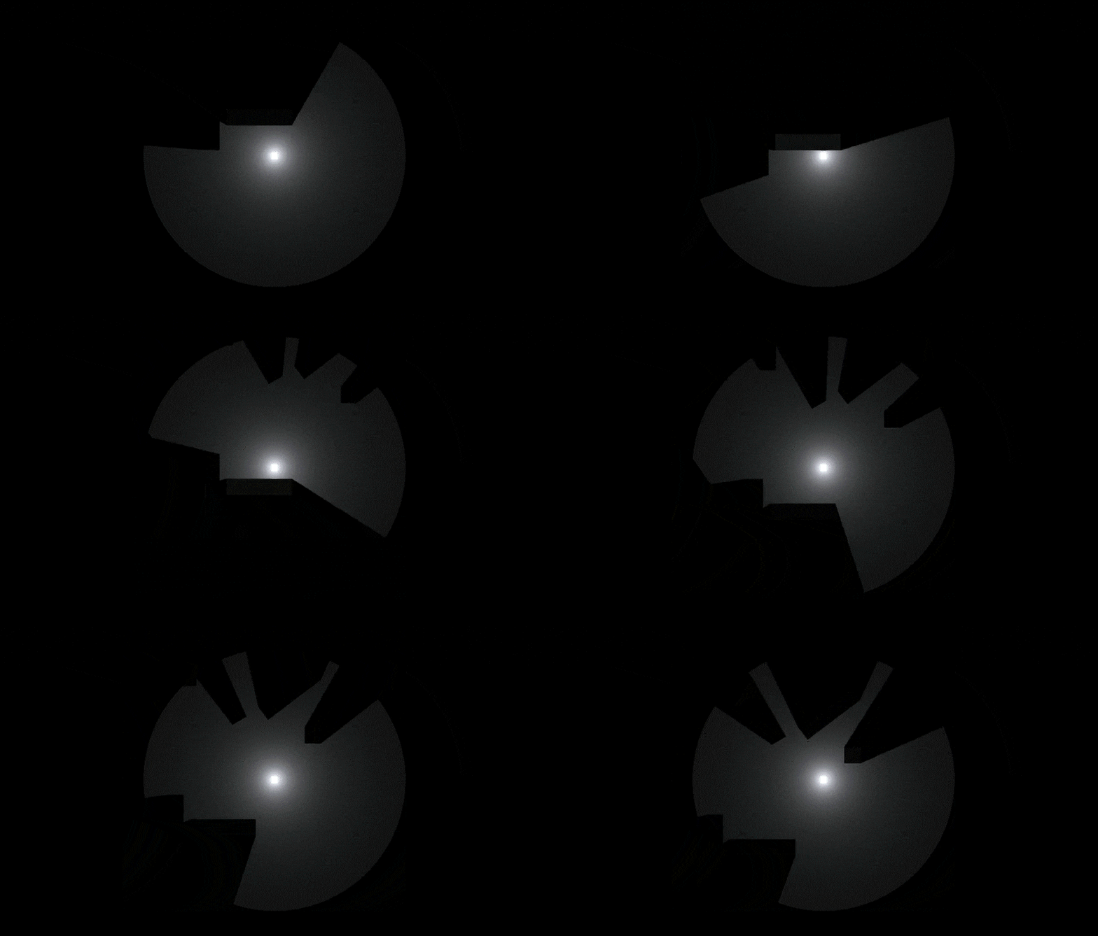
Final Output
1.4 2D Raycaster (GL) - 2nd iteration
- The previous method for generating rays was very inefficient with time complexity of O(n) as the loop had to run 3600 times every frame with a step size of 0.1.
- This issue was solved by detecting the edges of nearby objects and casting rays at them and then filling the space by generating mesh between them.
int numRays = Caster.LightContour.Count - 1;
LightMesh.mesh.vertices = Caster. LightContour. ToArray();
int[] triangles = new int[numRays * 3];
for (int i = 0; i < numRays * 3; i += 3)
{
triangles[i] = (i / 3 + 1) % numRays;
triangles[i + 1] = numRays;
triangles[i + 2] = (i7 3 + 2) % numRays;
}
LightMesh.mesh.triangles = triangles;
Final Output
This 2D Lighting System that I incorporated in the project was implemented by Unity in the later versions as a Package in URP Render Pipeline.
The blog discussing the 2D Lighting System has concluded. However, you can proceed to read further to know the remaining development and design process.
2.0 Environment Reflection
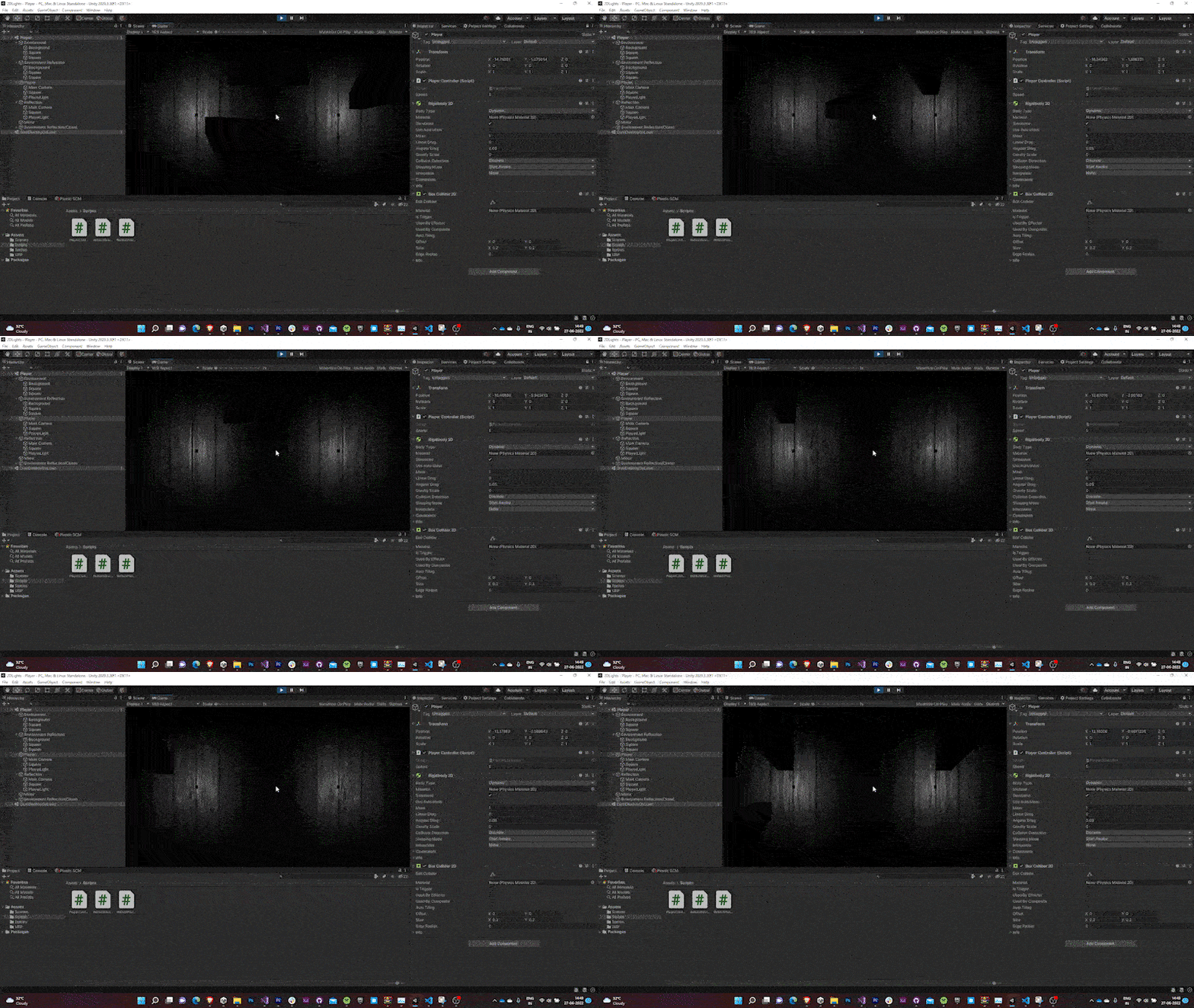
- Two players (each with their own top down camera) were added in either sides of the map separated by a box collider.
- The screen was split into two (one for each camera) by decreasing the width of the both camera’s viewport rect to 0.5 and offsetting one of them to 0.5.
3.0 Player Movement
- A simple rigidbody top down controller was yoinked from one of Brackeys tutorials for the first player while the movement of the second player was made to be governed by that of the first player’s.
void Update() { transform.position = player.transform.position * new Vector2(-1, 1); } - This inverts the movement of the second player horizontally (lateral inversion) as if their movements were mirrored.
3.1 Player Sprites & Animations
- Two sprite sheets of the top-down view of a male & female character (drawn by one of my teammates) walking were imported into the game.
These sprites were split into frames for animation using Unity’s inbuilt sprite editor.


Boy Sprite Sheet Girl Sprite Sheet These were animated at 10 fps.
The controller was tweaked to support both animation and smooth rotation of the player sprites.
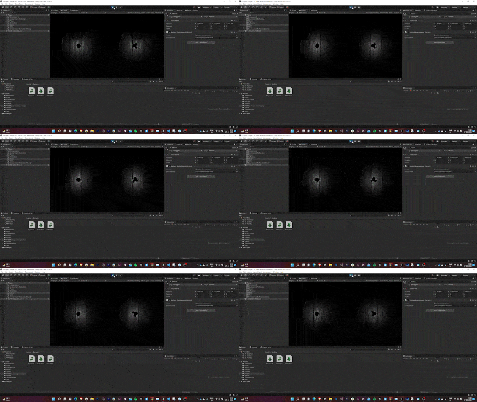
void Update() { movement = Vector2.zero; if (Input.GetAxis("Horizontal") != 0) movement.x = Input.GetAxis("Horizontal"); if (Input.GetAxis("Vertical") != 0) movement.y = Input.GetAxis("Vertical"); AnimatorEnable(); Vector2 movedir = rb. position - prevpos; if (movedir.magnitude*100 > 1) sprite. transform.rotation = Quaternion. Lerp(sprite.transform.rotation, Quaternion.Euler(0, 0, Mathf.Rad2Deg * Mathf.Atan2(movedir.y * 100, movedir.x * 100) - 90), rotSpeed*Time.deltaTime); } private void FixedUpdate() { rb.MovePosition(rb.position + movement.normalized * speed); prevpos = rb.position; } AnimatorEnable() { if (Input.GetAxis("Horizontal") != 0 || Input.GetAxis("Vertical") != 0) GetComponentInchildren<Animator>().Play("PlayerWalk"); else GetComponentInChildren<Animator>().Play("New State"); }- The translation is governed by Unity’s Physics engine (using rigidbodies) and is executed in the
FixedUpdate()method to keep it independent of frame rate. - The rotation of the sprite changes with its direction (governed by the combination of vertical and horizontal input).
- The translation and rotation speed is parametrically controlled by
speedandrotSpeedvariable exposed in the inspector. - The animation is simply enabled if we’re sending an input, else it stays disabled.
4.0 Button Mechanic
We decided to come up with a button mechanic system. The idea was to spawn two buttons (one in each world) and the player was expected to walk over both the buttons simultaneously to open the gates so that he can people can proceed to the next level.
- When the player walked over a button, the button’s sprite renderer glowed.
- Also, an event was called to check if the other button is pressed as well.
- If the other button was pressed, the gates (which were hinged at their corner) would rotate and the player could pass through them.

5.0 Movable Objects
To add more depth to the puzzles, we decided to come up with a few objects that the players could push in order to block or press something.
- A physics material (with high coefficient of friction value & 0 bounciness) is created.
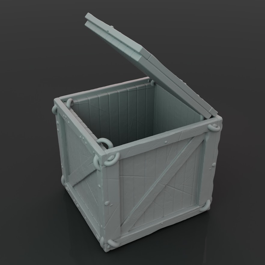
Sprites for movable objects (with hand-drawn texture maps by one of the teammates) are imported.


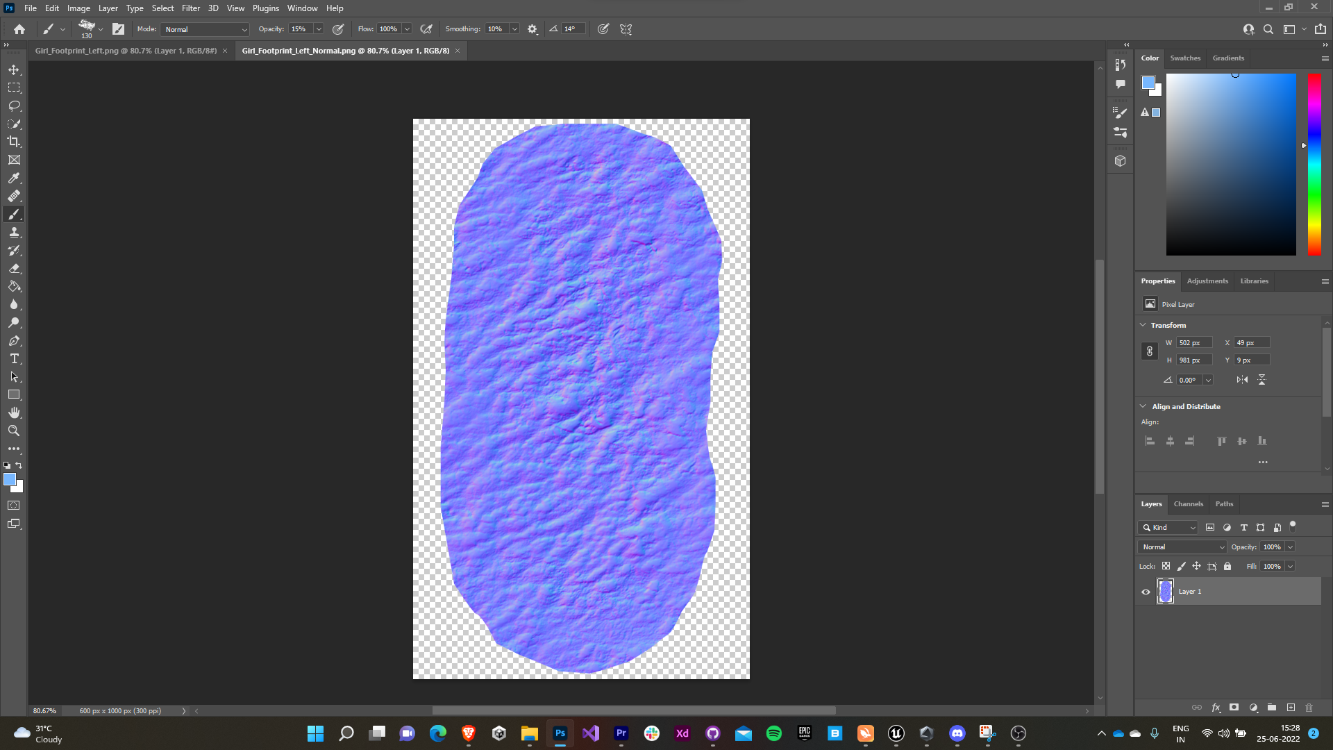
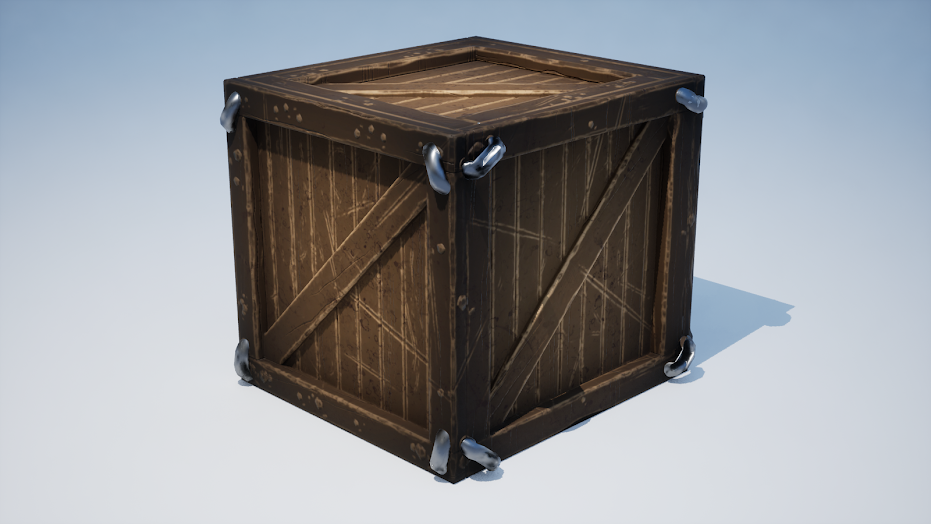
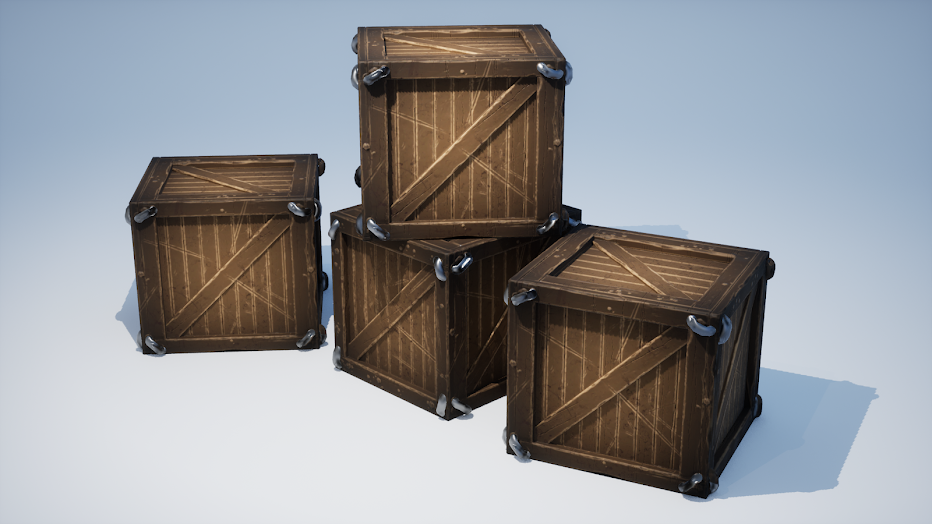
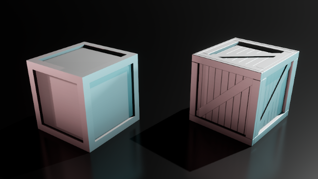
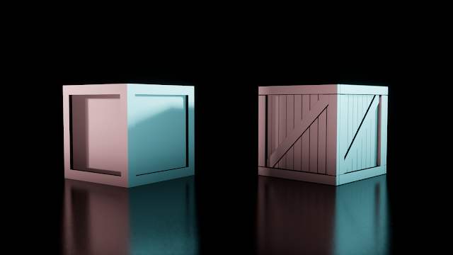
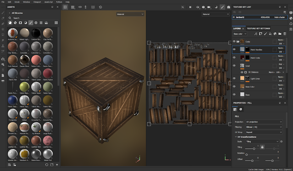
Crate Base Map Crate Normal Map These textures are assigned to the URP’s default lit sprite material.
- Their prefabs are created with Box Collider 2D & Rigidbody 2D components having the physics material assigned to them.

6.0 Death Mechanic
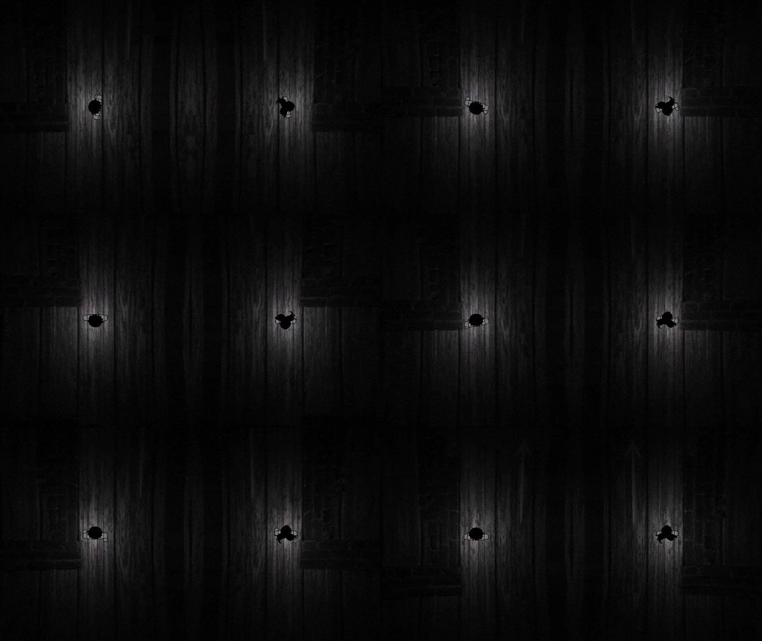
We decided to include spikes in the game. They would kill the players on contact, rendering few areas of the game as unapproachable. The death animations and effect were kept as brutal and gross (taking inspiration from Limbo) to add to the dark atmosphere of the game.
- Colliders were set up on the spikes (with ‘Death’ tag) and the player.
- If the player comes in contact with the spike a Coroutine containing all the relevant methods for death of the player is called.
  private void onCollisionEnter2D(Collision2D collision)
  {
      if (collision.gameObject.CompareTag("Death"))
      {
          dead = true;
          StartCoroutine(Death());
      }
  }
6.1 Spike Texture
- Since our core idea was to make the game atmospheric & appealing to eyes we wanted to keep environment ques pretty detailed. We decided to do the same with the spikes.
The spike texture maps were hand-drawn by one of the teammates. We had initially thought of including a height/bump map but later replaced it with a normal map.
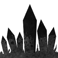
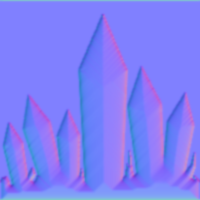
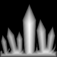
Spike Base Map Spike Normal Map Spike Height Map These textures are assigned to the URP’s default lit sprite material.
6.2 Death Animation
A sprite sheet for hand-drawn animation of blood splash was imported.

This sprite sheet was played on collision with the spikes.
- The movement state of the players were changed from animated to static.
- The movement vector of the players were overridden to be zero.
- The canvas was fade out to black and the level was reloaded.
  IEnumerator Death()
  {
      bloodsplash.SetActive(true);
      dead = true; GetComponentInChildren<Animator>().Play("Static");
      movement = Vector3.zero;
      GameObject.Find("CanvasGame").GetComponent<Animator>().Play("FadeOut");
      yield return new WaitForSeconds(.7f);
      SceneManager.LoadScene(SceneManager.GetActiveScene().name);
  }
Final Output
7.0 Level Design
The biggest challenge ahead of us was actually to come up with a level design that would keep the people engaged till the end of the game and not feel tiring at the same time (Since atmospheric games heavily rely on the level design). As the game was a submission to a gamejam we decided to keep the total play time around 10-15 minutes.
7.1 Initial levels
- The key concept of an accessible game design is to keep the initial levels of the game feel more like tutorials that help people stumble upon the core mechanics and gameplay features that game has to offer.
- The challenge with atmospheric though is that they can’t give away much visual cues about the game, the player is expected to explore and find it himself. But again, the game was a part of a game jam submission wherein the attention span of the players playing the game is quite small, so keeping things extremely vague might lead to less player retention. So we decided a sweet spot in between them.
The game started with a WSAD key sprite I made using Adobe XD fading into the scene giving the player idea of the controls.
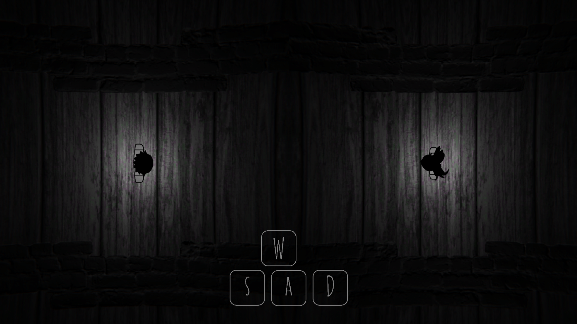
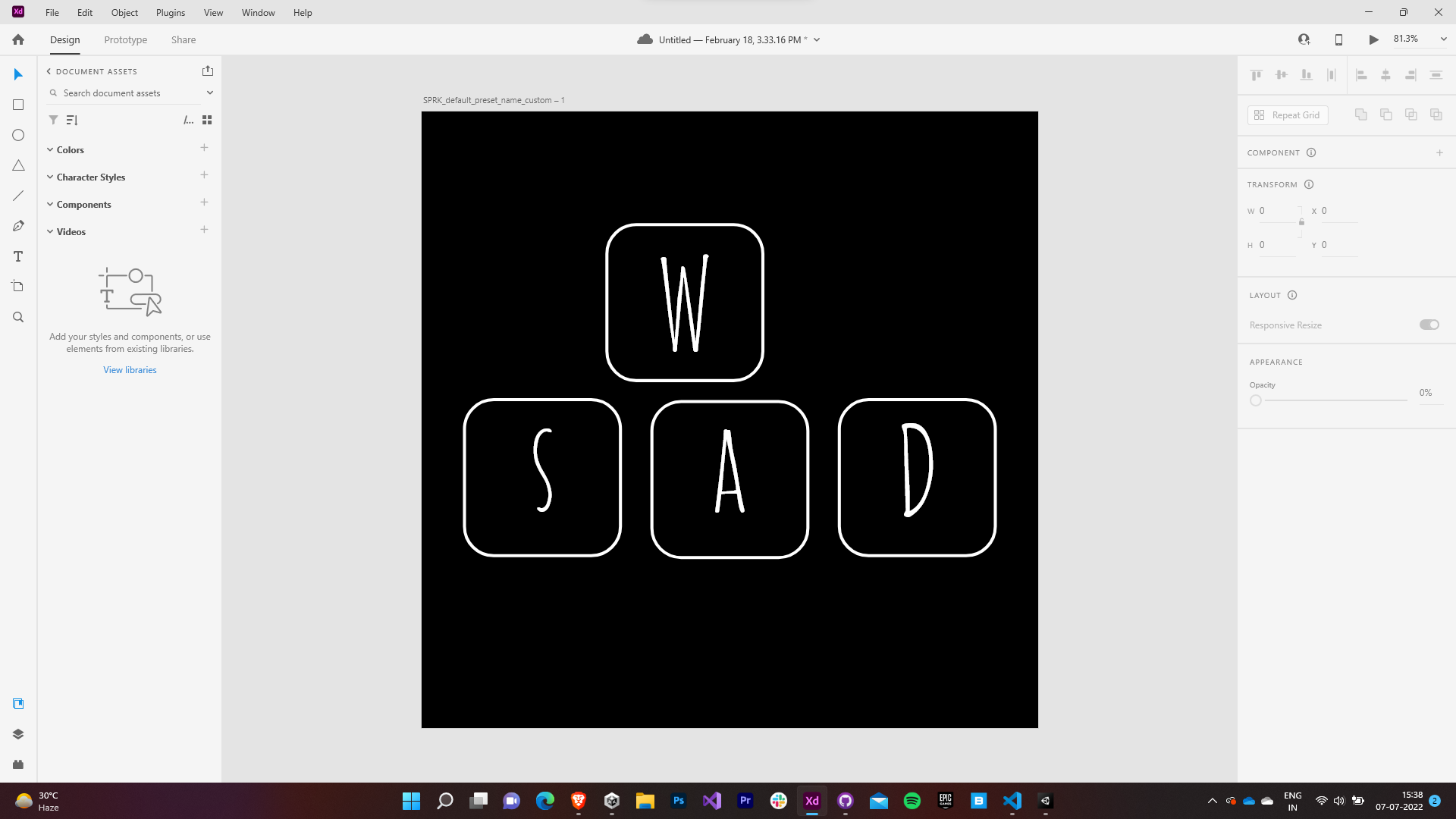
Key Sprite in Game Key Sprite made in Adobe XD An arrow sprite was made using Photoshop which was spawned in the game’s first level to guide directions to the gate that next level. These arrows were spawned if the player exceeded a certain threshold time to reach the gates.
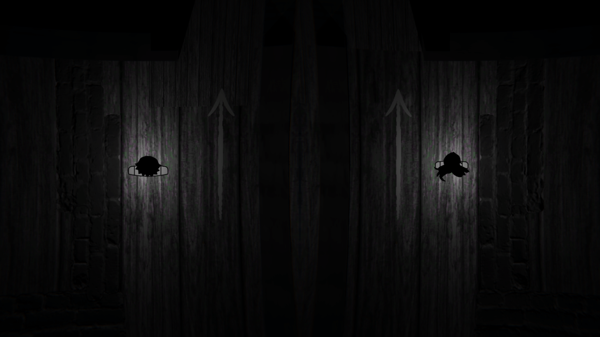
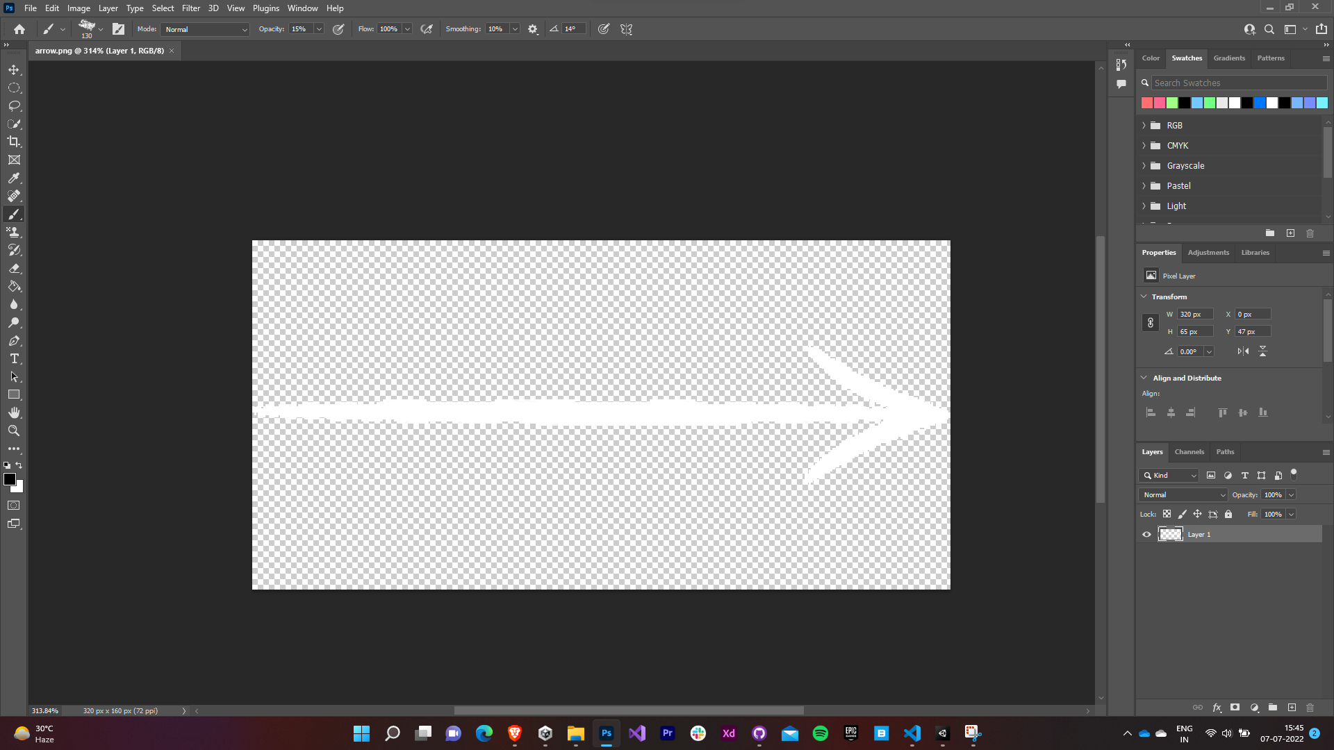
Arrow Sprite in Game Arrow Sprite made in Photoshop This level was kept simple and most importantly symmetric. The players were just expected to roam around, get familiar with the inversion mechanic and the gates that would progress them to the next level.
The first challenge was introduced in the next level as the it was kept asymmetric. Now players needed to figure out a way to make both the characters back in sync with each other so that they reach the gates.

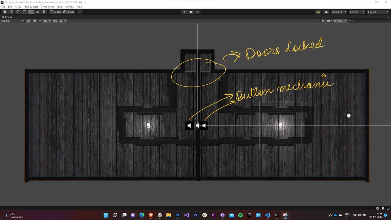
The third level introduced the button mechanic in the game. The gates are kept locked and the players are expected to align both the characters over the button simultaneously to unlock the game. The player would use the same method he used to sync both the characters in the previous level as the outline of both the levels is kept the same.

7.2 Later Levels
- The difficulty for the game was now gradually increased and the game now focused more on the player creatively finding out a way to solve the puzzles rather than teaching the player how to play.
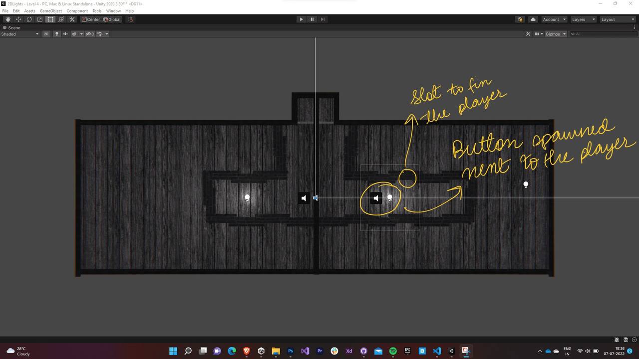
For the next level, the the button for one of the characters was spawned right next to him. Our solution to this was locking one of the players in the slots next to the button while the other traveled to his button. To our surprise the players came up with various other solutions to this puzzle too (This is true in the case of the subsequent levels as well).
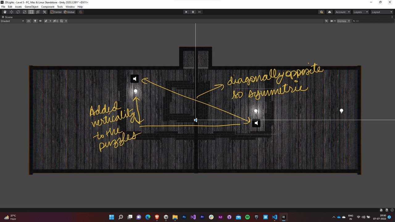
The next level had both the puzzles on different vertical levels but symmetric to each other.
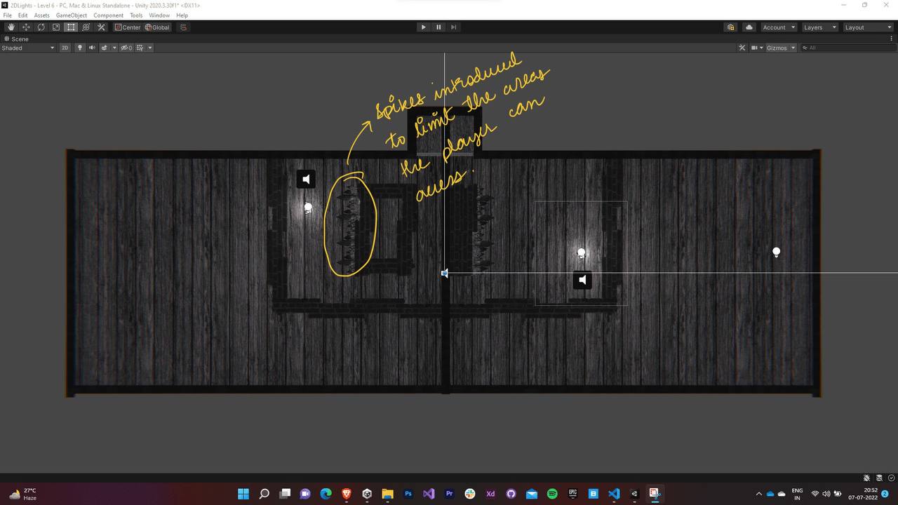
Now that the player knew how to sync the characters and solve the puzzles in both vertical and horizontal directions, it was now the time to introduce the spikes into the level. So the next was similar to the previous one except for the addition of spikes on some of the walls. This limited the areas that the player could explore to solve the puzzle.
The next level drastically increased the difficulty of the game by introducing a maze like map with the buttons at the end of the maze and spikes on a few of the walls. Lots of players exclaimed about getting stuck on this level.

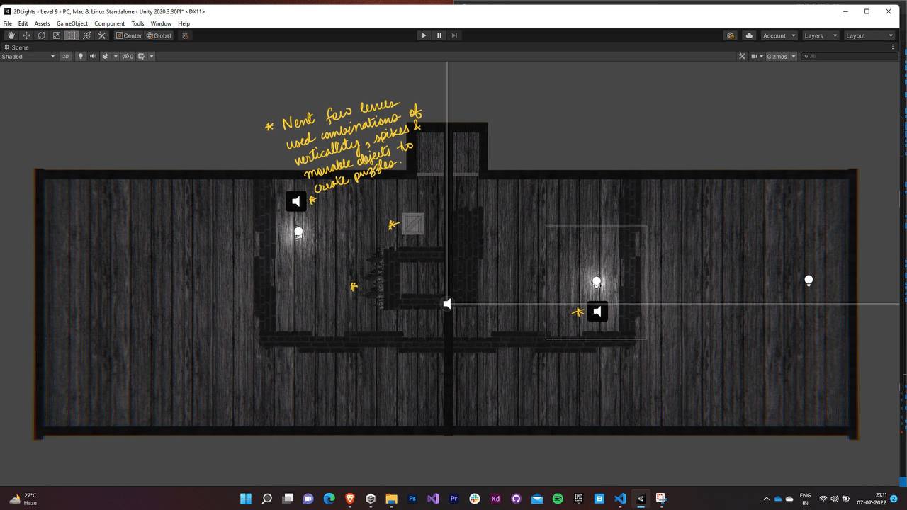
Now the players were introduced to the movable boxes that were to be strategically used to solve the puzzles.

The next few levels combined the usage of both box and spikes along with maze-like level designs.
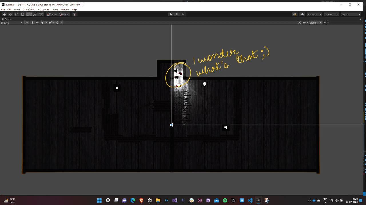
The final level involved a cliffhanger ending followed by the credit screen. Play the game to know more ;)
8.0 Post Processing
We used post processing to increase the immersion that the game offers. We decided to limit ourselves to the stack that were well optimized for WebGL builds.
- Lens distortion and Chromatic Aberration were added to the images rendered by the camera a more natural. This causes the shape of the images rendered by the camera to distort at the edges and thus increase the focus of the environment in proximity of both the players.
- We had planned on adding Bloom as well but since we weren’t Unity’s lighting system we would have to write the Bloom system for our lighting system. Due to deadlines for the gamejam approaching, we decided to shelve the idea.
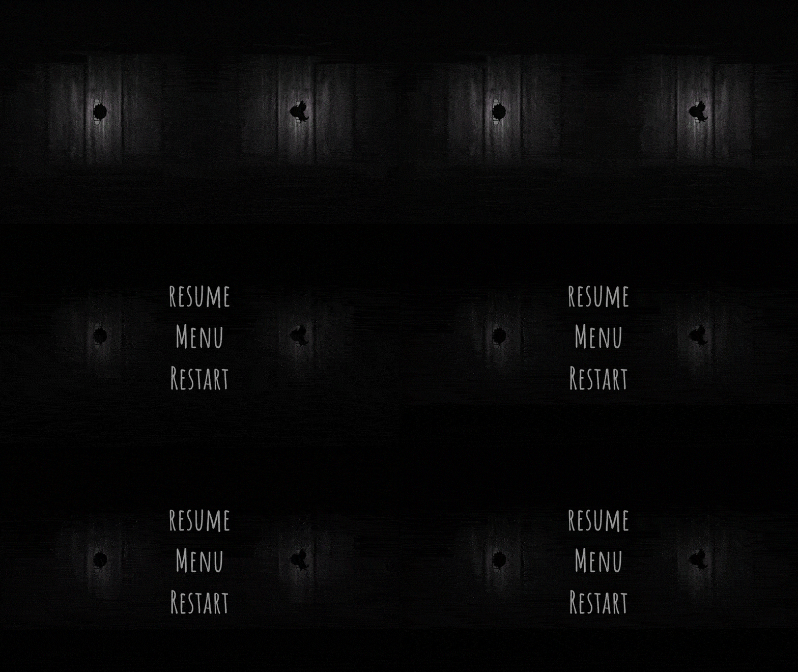
9.1 Font
- We browsed through a bunch of hand-drawn fonts for the game’s UI.
- We shortlisted to Architects Daughter, Amatic, and Blokletters and finally finalized Amatic.
- The color palette was kept limited and preferably lerped between black and white.

9.2 Animations
- The animations were kept minimal - fading, scaling, and translations.
- A canvas with black panel was used as an overlay and it was used for fading transitions between different scenes and menus.

9.3 Intro clip
We created a small clip using Unity’s timeline as with the text only, the menu seemed a little lifeless. Again, minimalism and dark atmosphere were the key.

|
9.4 Music & Sound Effects
- Simple sound effects imported from ZapSplat were used to for clicks, death, button press, gates and various other purposes.
.png)
